
HARBOR + SCAD Week5
Embracing compositing, 2.5 D projection, color correction, continuity quilt.
HARBOR
2/10/20256 min read
Update 5
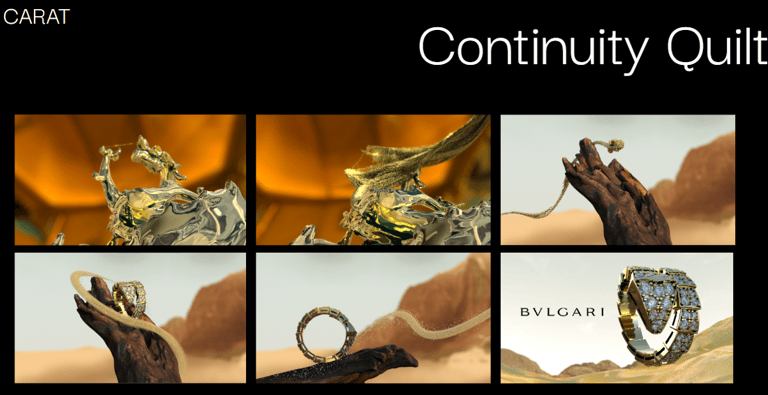
Continuity Quilt
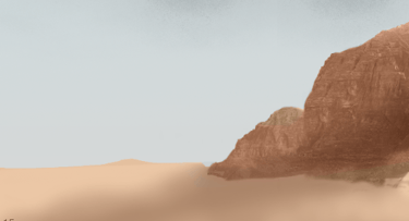
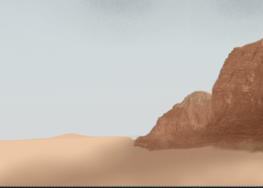
This week I worked on color correction in Da Vinci and nuke to match every scene of the dessert and make it a little bit more cohesive with all of the other elements. The first 2 scenes need more love, and I will work on them next week to improve the advertisment and make it look better everytime. I made this continuity quilt as last week so we can see the diferences and what is working in each shot and what can be improved.
Update 3
Shot 2 and 3
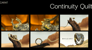
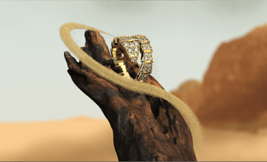
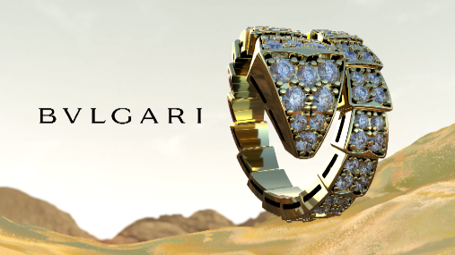
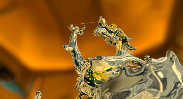
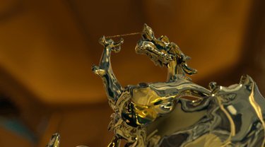
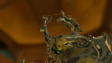
For shots 2 and 3, I played with the colors and fixed all the shots so they would look more cohesive with all of the advertisements. I started by working on shot two and color correcting the ring and branch and making the matte painting color more cohesive, playing with this idea that the dessert was more yellow as the mentors suggested. I played more on matching all of the elements that are part of these two shots. Also, I incorporated some Z depth so the matte painting could be merged better with the 3D renders in a more natural way that embraces that camera look.
I also played with starting to color correct the advertisement as one piece, but I will keep developing this idea further in the following weeks. Here are some before and afters; for most of the shots, I used multiple color-correct nodes, a z-depth pass, and all shuffles so I could separate AOVs and work on getting all elements together. My main focus for this week was matching colors of the abstract dessert.

Week 4


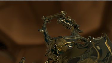
Week 5 - SHOT

Week 4

Week 5
Matte painting W5
Update 4
Shot 1 - Compositing
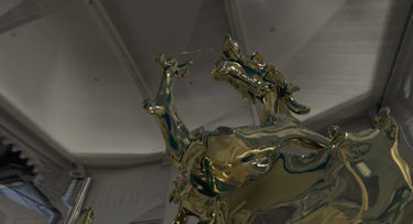
My favorite part of the job is when I start having more finalized renders because I can start compositing, working with all of the elements to make one picture come together and then make one piece of film or advertisment become one, making everything believable and cohesive has become one of the biggest passions of my life.
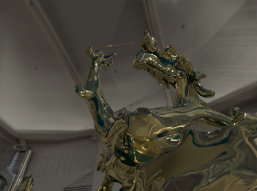
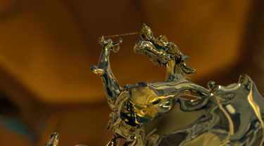
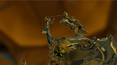
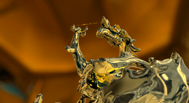
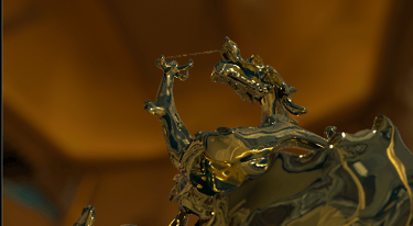
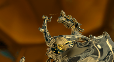
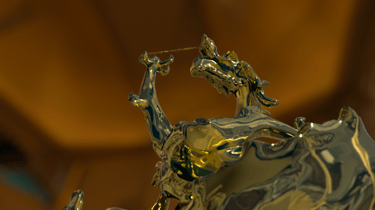
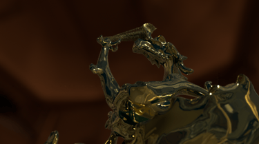
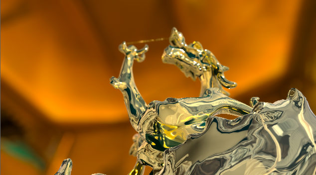
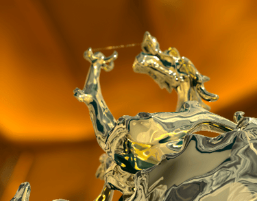
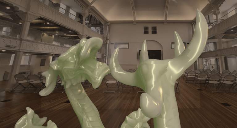
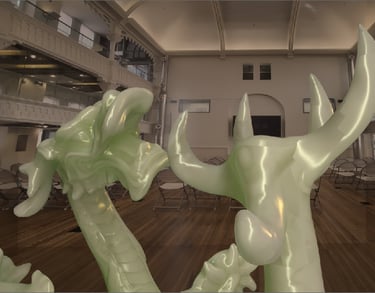
For shot one this week, I did not receive AOVs, so I worked on color-matching the 2.5D projection closer to the Bulgari gallery color and improving the color of the gold since the artists had some problems and rendered directly with the 2.5D projection in the background. Still, no ID pass or crypto mattes, and with Z depth as the only AOV, the smartest thing was to build up an alpha from the Zdepth pass with a shuffle; this was an idea I took from Professor Gaynor's suggestion on how to approach this plate. After separating the elements, I worked on the color correction for the ground, the dragon on the golden shader, and the jade, which posed some challenges due to the lighting in the original render. I did this by using the Z depth pass as a mask on the color correction nodes, and for the dragon using an inverting node, so I could color correct all elements separately. I also worked on incorporating Z depth so we could play with the background. It is not perfect, and I am still not happy with this shot and the color so I will work on it on improving in the following weeks.
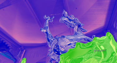
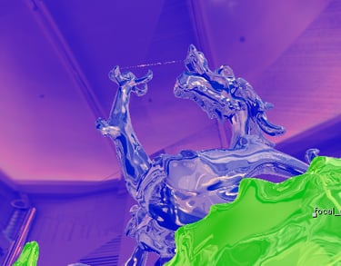
Z depth -focal plane setup
Color Tests - Matching to the reference
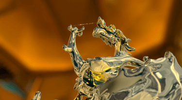

Original render
Final Render
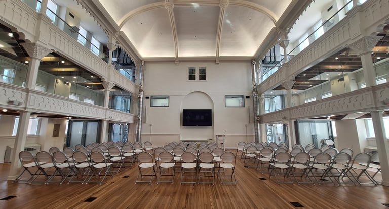
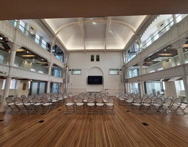
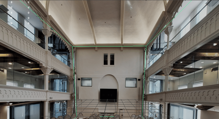
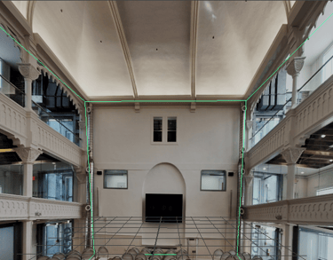
I was working on Nuke with the old background, but the professors suggested we get our pictures to do this projection. I was in the student center and worked on taking a new photo; I also worked on Photoshop and cleaning the picture up so that what is seen could be embraced by the high-fashion environment we want to portray.
I went to Maya once we changed the picture because we were going to render shots 1-1 in Maya, so I set it up there in Maya so the gold shader could reflect, and we switch all to Houdini, so Mia helped me to set it up because I did not know how to project in Houdini.
Picture of the student center
Update 2
Shot 1 - 2.5D projection
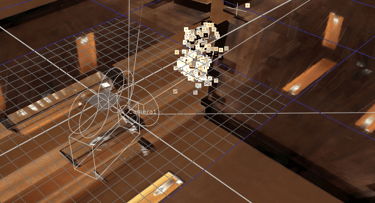
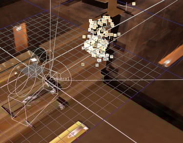
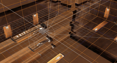
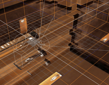
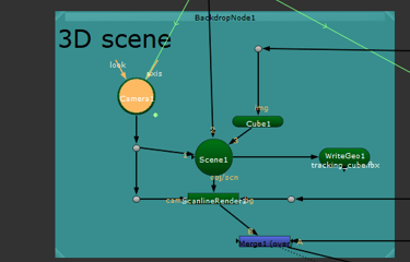
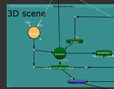
This week, I worked on getting a 2.5D projection set up so the team could use it to reflect on the gold shadders and get the background working for the background of scene 1. I worked on it in two places, one of which was Nuke, where I set up a 3D scene and worked on setting this background to surround the render once it was worked on. I also set it up in Maya so that it could be used for the gold shader reflections, so we did that by using fbx files. So we could also have it in Houdini. In the middle of this week, we decided to cut Maya from our pipeline and only render from Houdini. In the pictures you can see the camera, the projection and a little point cloud of the statue representation on the 3d scene. The second image is whitout the point cloud, and a little bit of the script set up is the third picture.
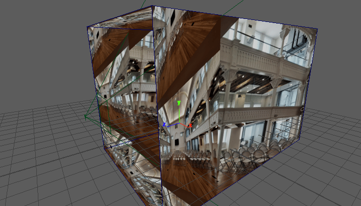
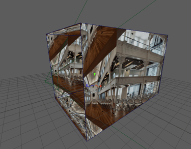
Maya projection
Nuke projection
I worked along with Mia to get this working and functional and she did some tests with the shaders and how it will look like with our old camera. After the weeked passed this camera changed and we are working on improving how everything looks. This is one of the first tests, Mia rendered the frame to see it with the texture.
After this we switch the dragon to be in the middle of the room, and we rendered with the new camera. Because the mentors requested we made one shot together of shot 1 and shot 2.
Update 1
Meeting with Harbor - Mid point
In the past week, we worked as a team to embrace the new story and presented it to the mentors. Since all of them were confused about why we incorporated a diamond, we decided to develop a more solid story where the dragon changes into gold and then disintegrates into gold particles that will become the ring. With these changes, the mentors gave us this feedback for the week.
Shot 1-1:
fx good, but both sides do the effect at the same time.
Combine shot 1-1/1-2 (see if necessary you can cut cameras in the middle)
Camera fixes
Evaluate rack focus.
Make more distance.
Shot 1-2:
Too wide, simplify motion blut particles
Shot 2-1:
The background is too fake; it needs more work.
The texture aligns with the last shot.
Lighting is weird
The ring waits too long to fall.
Balance the speed
Make the camera move more gracefully.
Shot 2-2:
Sonic the Hedgehog (reference) - Move is unrealistic and too fast.
Balance the speed
See a better dune color palette and adjust the background.
Shot 3-1
The background is distracting.
The shader for the gold adds a secondary reflection.
VFX compositor
Showcase of my VFX art and projects.
© 2025. All rights reserved.